
Page 27 - Data Science Algorithms in a Week
P. 27
Classification Using K Nearest Neighbors
# Convert the array into the format ready for drawing functions.
data_processed = common.get_x_y_colors(data)
# Draw the graph.
plt.title('Mary and temperature preferences')
plt.xlabel('temperature in C')
plt.ylabel('wind speed in kmph')
plt.axis([temp_from, temp_to, wind_from, wind_to])
# Add legends to the graph.
blue_patch = mpatches.Patch(color='blue', label='cold')
red_patch = mpatches.Patch(color='red', label='warm')
plt.legend(handles=[blue_patch, red_patch])
plt.scatter(data_processed['x'], data_processed['y'],
c=data_processed['colors'], s=[1400] * len(data))
plt.show()
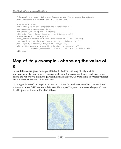
Map of Italy example - choosing the value of
k
In our data, we are given some points (about 1%) from the map of Italy and its
surroundings. The blue points represent water and the green points represent land; white
points are not known. From the partial information given, we would like to predict whether
there is water or land in the white areas.
Drawing only 1% of the map data in the picture would be almost invisible. If, instead, we
were given about 33 times more data from the map of Italy and its surroundings and drew
it in the picture, it would look like below:
[ 15 ]