
Page 24 - Packaging News magazine Sep-Oct 2022
P. 24
BRAND & PACK DESIGN
Sophisticated style
Creative agency Boxer & Co has created a distinctive visual language for beverage company Altina’s new non-alcoholic drink brand.
THE DIRECTIVE FOR the brief, explains Gwen Blake MD, Boxer & Co, was “to create a memorable visual language to push the brand into a more sophisticated, luxury territory, for consumers to experi- ence the same level of sophistication with a non-alcoholic product, as they can with a standard wine”.
The scientist owners behind this non-alcoholic drink brand use “mixol- ogy mastery to blend native botanical ingredients and create unexpected, intriguing and satisfying drinking experiences”, and Boxer & Co’s task was to bring that to life with a suite of visual assets.
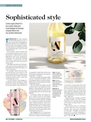
Although the product isn’t alcoholic, some cues have been taking from wine packaging to help define the usage occa- sion to customers.
For example, Altina’s previous wrap- around label has been moved to the front and back formation, which is more commonly used by vintners. The small round-neck label is also a nod to the visual language of wine.
“At the forefront of the design is a strong and unique monogram, which is the heart of the new branding and has become Altina’s “powerful and very
recognisable symbol that elevates the brand and communicates its outstand- ing quality,” says Blake.
More than a simple monogram, Blake says it’s a “sensorial monogram”, in that each element of it has a reason to be there, linked to the sensations experienced when drinking the product.
The rosé, white and sangria variants each have their own collection of tasty graphics, representing the taste gained from the unique blend of native botani- cal ingredients such as Forest Berry and Hibiscus.
According to Blake, the design cre- ates a unique visual for each drink, based on four variant-specific elements that define its flavour profile, resulting in a strong and ownable personality while aiding navigation. This story- telling expands on the back of pack, where the elements are pulled apart and described, working as simple tast- ing notes to add to the enjoyment of the consumption experience.
She highlights the ‘La Vie En Rose’ variant, pointing out that it showcases black dots to represent subtle tang, pink
Above: The design creates a unique visual for each wine, based on four elements that define its flavour profile.
Right: This story is further told on the back of pack, where the elements work as simple tasting notes.
Below left: The directive for the brief was to create a memorable visual language to push the brand into a more sophisticated luxury territory.
rose petals to represent the colour and aroma, a lemon yellow dot to portray the citrus notes and the skeleton of a leaf to represent the crisp finish.“Most importantly the complexity and detail in the design speaks to the expertise and science behind the creation of the bever- ages,” Blake says.
Christina DeLay, founder and CEO at Altina Drinks, says that working with Boxer & Co has allowed the win- ery to elevate its Altina brand “to true luxury status.
The response from our customers and the trade has been universally positive. The team were wonderful to work with – I’d highly recommend Boxer & Co to anyone looking for a packaging design partner in the FMCG space,” she said. ■
24 ❙ SEPTEMBER – OCTOBER 2022
WWW.PACKAGINGNEWS.COM.AU
