
Page 56 - Print21 March-April 2022
P. 56
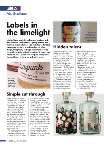
      Distinctive and memorable: Labels illustrated by Gary
Taxali, designed by Co Partnership, and printed by MCC
                  Print Excellence
Labels in the limelight
Labels shine a spotlight on branded products and their contents. The best stock, quality printing and finishing, colour selection, size and shape, standout images and artwork, brand consistency, killer design, typography and copy combine to provide eye-catching, unforgettable creations. To inspire and please the eye, Colleen Bate compiled examples of standout labels in the wine and spirits sector.
Natural: The two-colour Cowpunk labels are printed on 100 per cent cotton paper
Simple cut through
Hidden talent
 Australian wine brand The Hidden Sea released a 6-pack Christmas-edition, co-branded bottle of its 2018 Friends of Friends wine, with bottles from Saverglass,
and labels illustrated by
Gary Taxali, designed by branding and packaging design agency Co Partnership and printed by Multi-Color Corporation (MCC).
Gary Taxali, who is known for his iconic retro style pop art and illustrations and is recognised as one of the top 100 illustrators in the world by book publisher Taschen, was commissioned to create the artwork for the Friends
of Friends labels while Co Partnership designed them,
keeping to the ‘distinctive and memorable’ brief.
In printing the wine labels, the experienced team of label engineers at MCC took a consultative approach and worked closely with The Hidden Sea from inception to finished product.
Every sale of its 6-pack contributed towards the ReSea Project to remove and recycle 60 single-use plastic bottles from the world’s oceans. In February 2022, the wine brand achieved
a major milestone to help remove 10 million plastic bottles from the oceans in just 18 months, bringing it closer to its ultimate goal to remove one billion by 2030.
    Australian winery Cowpunk Wines launched its inaugural brand last year – a natural wine range with packaging designed by Denomination.
To highlight the difference
in the wine style, the bottle comes with a swing-top closure, making the bottle 100 per
cent resealable and re-usable with the aim of eventually having refill stations at selected retailers. It also contains a “re-use it” message on the back label and shipper, encouraging consumers to re-use the packaging as opposed to simply recycling it.
The simple two-colour print on the label (by Multi-Color Corporation) cuts down on ink usage, no gloss varnishes
or treatments are used on the finishing, and the stock is a natural 100 per cent cotton paper with impurities and slight variations in tone.
Freshness is the key benefit of natural wines, and to emphasise this the labels are hand-stamped with not only the year but also the month and day the grapes were picked, akin to the use by date on fresh foods. This also has the added benefit of communicating the small batch, hand-made nature of the wine.
A series of icons, inspired by cattle branding, replaces the traditional back label copy. The short and simple infographics are used on both the labels and shippers.
 56     MARCH/APRIL 2022
