Page 13 - brand manual
P. 13
LOGO


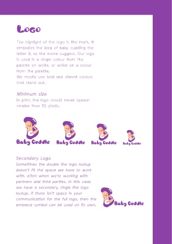
             The highlight of the logo is the mark. It
             embodies the idea of baby cuddling the

             letter B, as the name suggest. Our logo
             is used in a single colour from the

             palette on white, or white on a colour
             from the palette.

             We mostly use bold and vibrant colours
             that stand out.


             Minimum size

             In print, the logo should never appear
             smaller than 50 pixels.


            Secondary Logo

            Sometimes the double line logo lockup
            doesn’t fit the space we have to work
            with, often when we’re working with

            partners and third parties. In this case,

            we have a secondary, single line logo
            lockup. If there isn’t space in your
            communication for the full logo, then the

            embrace symbol can be used on its own.

