Page 247 - NUMINO TG_6A
P. 247
16Unit Everything Is Out of 100
jOb ective Learn the basics of percentages and how to form graphs based on percentages.
1. Textbook Instructions 16 Everything Is Out of 100
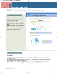
In this unit, students will learn how to express Students in Thomas’ class voted on their favorite color. The table shows
percentages into various types of graphs. the percent of votes each color received.
Explain both types of graphs.
Favorite Colors
Draw both types of graphs with the students. Color Blue Red Green Pink Total
Percent(%) 25 15 10 50 100
Which color has the highest percentage?
Pink. Use the table to draw a band graph.
Which color has the lowest percentage? Favorite Colors
0 10 20 30 40 50 60 70 80 90 100(%)
Green.
How much of the class likes pink? 50%.
In a fraction, how much is 50%? 1 . Blue Red Green Pink
2 25% 15% 10% 50%
A band graph is a graph that shows how parts are related to a whole.
Use the table to draw a circle graph.
Favorite Colors
Pink Blue A circle graph is a graph
50% 25% that shows parts of a whole.
Red
15%
Green
10%
138
2. Build Understanding
Before you get into more elaborate operations, give students some basic tips to help their understanding of
both types of graphs.
Band graphs show how everything adds up to a whole. Think of the different portions of a band graph as little
chunks building together to make one whole thing.
Circle graphs allow you to see how everything compares to everything else. It all forms one whole circle, or
“pie,” but it’s also very useful for seeing how one portion is greater or smaller than another.
230 NUMINO Teacher s Guide


