Page 248 - NUMINO TG_6A
P. 248
16Everything Is Out of 100 Unit
CMath Vo abulary band graph: a graph that shows how parts are related to the whole
circle graph: a graph that shows parts of a whole
Objective: Learn how to show data as percents and make various graphs
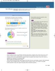
Use the band and circle graphs to answer the questions. Have students answer the questions using
The band graph shows students’ favorite seasons in Ann’s class. the band and circle graphs.
Favorite Seasons Ask students questions about the graphs and
0 10 20 30 40 50 60 70 80 90 100(%) the work they’ve done so far.
What is the main advantage of the circle
Spring Summer Fall Winter graph? The circle graph is easier when trying
20% 40% 15% 25% to determine a comparison against the whole.
What is the main advantage of the band
Which season do students in Ann’s class like the most? Summer graph? Sizes are easier to compare with the
What percent of the students likes winter? 25% band graph.
What is the chief disadvantage of the
The circle graph shows the percent of votes each candidate received in the class circle graph? The circle graph is harder to
president election in Jessica’s class. read.
What is the chief disadvantage of a band
Votes graph? It’s harder to see how things relate to
each other with the band graph.
Ryan Kate Who was selected as the class president?
10% 40%
Kate
Jessica
20% What percent of votes did Ricky receive?
Ricky 30%
30%
Chat
Discuss the characteristics of circle and band graphs.
Circle graphs are easy to compare, but band graphs are easy to read.
16. Everything Is Out of 100 139
Some students may have some difficulty with basic observations of graphs at first. Advise them to be on the
lookout for basic errors in reading graphs. For example, with a band graph, students may mistake the bar
closest to 100 on the number line for the highest number in the graph, even though it may not be. Here’s an
example from the graph on the textbook page.
Which season is the class favorite? Winter.
This is incorrect. Because winter is the furthest to the right on the line, and therefore closest to 100, the student
thought it was the highest number. The highest number is actually summer, in the middle of the graph.
Remind students to study each graph thoroughly before answering a question.
6A Unit 16 231


