Page 59 - final process book print.hoda
P. 59
Chapter Five: Prototyping
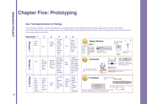
User Test Implementation & Findings
The user test was conducted, and the users' responses to the designed questions were categorized into three frames: happy-neutral, confused, and frustrated.
Next, I tried to keep the items raised in the green frame in the mid/high fidelity prototype design and simplify the issues raised in the orange frame and provide new solutions
for the issues raised in the red frame.
Questions 1 2 3 4 5 6
RESEARCH PROJECT
It is like Inbox, I
Yes it a gift Happy-Neutral The details of each
It was don’t exercise are well
was for the
easy to think it provided.
good work current It is great
Yes treat- Yes should to collect
be in the
ment home daily
exercises
process in the
page The invitation to This game part is
of the form of exercise is very clear
Person 1
videos. interesting
clinic
This will I didn’t
No I Naviga- be a great understand Confused
Yes couldn’t tion in help and Defi- the num- I think the icon related to
find the this app patients nitely bers given preferences is not appropriate.
game was can do for the pain Isn't this setting's icon?
part smooth the exer- level and
easily cises did not find I’m a bit confused, what day
Person 2
without the game does this level of pain belong Why should the inbox be on the
to? home page???
mistakes. part
I am sure Icons,
flow I didn’t all This is results Frustrated What do these numbers
mean?
was under- patients page,
a good
good stand It was will idea. and the
but I the welcome text
easy yes, I
need results using this writing Do I have to write everything??? No I don’t feel
use it.
Person 3
more part app. section like writing.
infor- correct- for I thought by selecting this I would find the description of the muscles,
mation ly feedback this does not indicate at all that I will go to gaming section
57

