
Page 145 - Algebra 1
P. 145
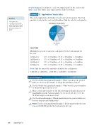
A circle graph uses sections of a circle to compare parts of the circle to the whole circle. The whole circle represents the entire set of data.
Application: Yearly Sales
The circle graph shows Art Online’s total yearly sales by quarter. The total amount of sales for the year was $20 million. Find the sales for each quarter.
Example
5
Caution
Circle graphs are sometimes labeled with actual data values instead of percents. Always check the labels and keys of a graph.
Art Online Yearly Sales
4th Quarter 43%
1st Quarter 12%
2nd Quarter 32%
SOLUTION
3rd Quarter 13%
Multiply the percent of sales for each quarter by the total amount for the year.
1st Quarter: 2nd Quarter: 3rd Quarter: 4th Quarter:
12% × 20 million = 0.12 × 20 million = 2.4 million 32% × 20 million = 0.32 × 20 million = 6.4 million 13% × 20 million = 0.13 × 20 million = 2.6 million 43% × 20 million = 0.43 × 20 million = 8.6 million
Check Find the sum of the amounts calculated for each quarter. 2,400,000 + 6,400,000 + 2,600,000 + 8,600,000 = 20,000,000
Lesson Practice
130 Saxon Algebra 1
a.
(Ex 1)
b.
(Ex 3)
c.
(Ex 2)
d.
(Ex 4)
e.
(Ex 5)
Use the double-bar graph in Example 1. What year shows the greatest difference between the number of shops Sal and Harry owned?
Use the double-line graph in Example 3. What was the greatest number of shops Sal opened in one year?
Make a stem-and-leaf plot of the data showing the height in inches of grandchildren in the Jackson family: 56, 52, 68, 49, 49, 40, 72, 71, 43, 54. What height occurs most often?
Use the data in Example 4. Which month shows the greatest difference between deposits and withdrawals?
Predict Use the circle graph from Example 5. If first quarter sales the next year are $3,000,000, predict the total sales for the year.
