Page 75 - Penta Book's ICT Catalogue
P. 75
TASK 4
                         Advanced charts


                         Chart types

                         To make your data presentations more lively and interesting,
                         you can use charts and graphs.


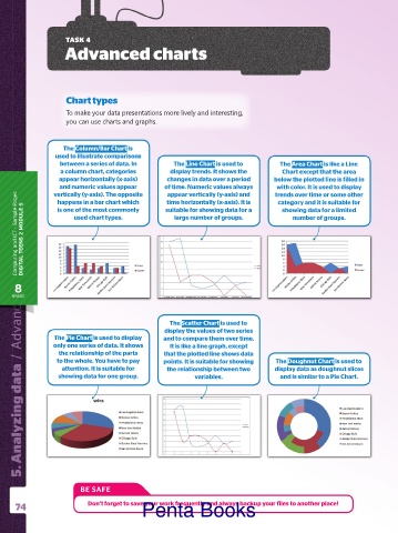
                        The Column/Bar Chart is
                      used to illustrate comparisons
                       between a series of data. In      The Line Chart is used to       The Area Chart is like a Line
                       a column chart, categories       display trends. It shows the     Chart except that the area
                       appear horizontally (x-axis)    changes in data over a period   below the plotted line is filled in
                       and numeric values appear      of time. Numeric values always   trends over time or some other
                                                                                        with color. It is used to display
                     vertically (y-axis). The opposite
                                                       appear vertically (y-axis) and
          Computing and ICT  .  Sample Pages DIGITAL TEENS 2 MODULE 5  used chart types.  large number of groups.  number of groups.
                      happens in a bar chart which
                                                       time horizontally (x-axis). It is
                                                                                        category and it is suitable for
                                                       suitable for showing data for a
                      is one of the most commonly
                                                                                         showing data for a limited
            /  Advanced charts /  Advanced charts     display the values of two series
            5. Analyzing data  /  Advanced charts
            5. Analyzing data  /  Advanced charts


          8
         GRADE


                                                        The Scatter Chart is used to

                     The Pie Chart is used to display
                     only one series of data. It shows
                                                        It is like a line graph, except
                       the relationship of the parts
                                                      that the plotted line shows data
                      to the whole. You have to pay   and to compare them over time.   The Doughnut Chart is used to
                                                      points. It is suitable for showing
                        attention. It is suitable for   the relationship between two   display data as doughnut slices
                       showing data for one group.             variables.                and is similar to a Pie Chart.


                             BE SAFE

          74                    Don’t forget to save your work frequently and always backup your files to another place!
                                                Penta Books

