
Page 20 - Advertising Annual 55
P. 20
TYPOGRAPHY
Typefaces Find Their Footing
Allan Haley
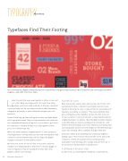
The soft terminals, slightly condensed proportions and modest x-height of Jorge Cisternas’s Decour give the slab serif design uncommon elegance—and a hint of art deco allure.
Lately it seems that every new typeface is either a sans serif or a script. What ever happened to the serif? How many OpenType script fonts with hundreds of alternate characters
can we possibly use? Do we really need yet another humanistic, calligraphic, geometric or quasi–industrial strength sans serif typeface?
It wasn’t that long ago that serif typefaces were the alpha animal of the typographic world. They not only dominated sans serifs, but also outnumbered them by a long shot. OK, you have to go back to the early years of desktop design, but, as typographic history goes, it’s not that long a trip.
Where did all the stalwart, straightforward—or even quirky and charmingly fancy—serif typefaces go? Can new serif typefaces find a home in a world dominated by serif-less fonts? Are graphic designers doomed to a world without serifs?
Of course not. Serifs are here to stay. In fact, more and more designers are making typefaces with feet. I’ve found a gaggle of new serif typefaces that are bucking the trends: slab serifs, glyphics, didones and old styles.
Surfeit of sans
Ryan Arruda, who curates, plans and executes all of Fonts.com’s quarterly promotions—and who has probably seen more new typefaces than anyone—has a couple of theories about why serif typefaces are making a comeback. “The visual attributes that give serif typefaces their dignified air were the first to be lost
in low-resolution screen environments as type transitioned into a digital landscape,” he explains. “Now that high-resolution displays are proliferating, we may be reaching a form of parity for serifs between the printed page and screen. Granted, you’ll always have your typographic purists, but serif designs are definitely having an easier time showing off the subtleties that give them life.”
Arruda also thinks that something very untechnical might be playing a part. “The increased interest in the serif is akin to the resurgence of vinyl among both veteran and burgeoning audiophiles—part ideology, part nostalgia and part sheer joy of discovery by a new generation of practitioners.”
A different kind of slab
As with most successful typeface designers, Jorge Cisternas,
20 Illustration Annual 2016
