
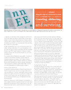
Page 22 - Advertising Annual 55
P. 22
                TYPOGRAPHY
                                                                                                                              When Jakob Runge’s FF Franziska (left) is enlarged, you can see the influence of calligraphic lettering and its wealth of subtle details. The large x-height, open counters and forthright serifs of Mike Abbink’s Brando (right) make just about any copy easy to read.
a collaborator at Latinotype, creates new typefaces with the end user in mind. When asked why he thinks graphic and interactive designers should consider using serif typefaces, Cisternas answers, “Function and personality are vital when it comes to these choices. Serif typefaces are ideal for use in long texts and, at the same time, give a design more expressivity.”
His Decour family grew out of a love of architecture and art deco design—and type-design savvy. “I’ve seen many typefaces in art deco style that have too much ornamentation and lack versatility,” Cisternas says. “This is what inspired me to design an elegant, slender and at the same time functional typeface for use in text and display sizes.”
The completed slab serif family has seven weights of normal and condensed roman designs, each with a corresponding italic. Complementing these are fourteen “soft” designs. A modest lowercase x-height, relatively condensed capitals, and characters like the A and E give Decour its art deco demeanor. Although it’s a slab serif, which is normally a square-jawed design, Cisternas succeeded in giving Decour a definite quality of elegance.
Design partnership
Serif typefaces challenge designers to harness diverse influences. “We like to explore and go outside of our design comfort zone,” says Veronika Burian, co-founder of TypeTogether with her design partner José Scaglione. “This forces us to dive into research, and it helps us keep a flexible mind. The Abril family was the first project where we tackled the issue of multiplatform and multi- media publishing.”
Designed for editorial use in print newspapers and magazines, as well as digital media, Abril is a typeface family of two worlds. Abril Display takes its inspiration from the elegant didones of the late 18th and early 19th centuries, and Abril Text has its foundation in
19th-century slab serif and Scotch Roman typefaces. Although based on the same shapes and proportions, the two designs serve two very different purposes. “We originally sketched the display versions of Abril and started playing with the concept of removing contrast in order to achieve a text version that would be halfway between a slab serif and a Scotch Roman typeface,” says Burian. “After our initial tests, we realized that the results were not ideal when compared with other newspaper typefaces like Utopia and Nimrod. We concluded that some more reengineering and, more important, some changes in proportions were necessary if Abril was to compete head-to-head with the established workhorses.”
Although most typeface design is a solo process, Burian and Scaglione share the task in perfect harmony. “First, we discuss the idea and design direction we want to explore,” Burian explains. “Then, we both draw sketches using only a few control characters. Finally, we discuss the results. Once we agree on the DNA of the new typeface, we split the work and give each other feedback—or sometimes, we swap responsibilities.”
Typographic hybrid
Like Abril, Jakob Runge’s FF Franziska is also a design with a dual personality. According to Runge, “The concept was to make it
a hybrid, to meld the best of two type styles into one great typeface. I took a Renaissance calligraphic skeleton to give the design humanistic—and highly legible—character shapes. This was then covered by a symmetrical neoclassical stroke thickness.”
Runge drew asymmetrical serifs, sheared ball terminals and rounded the vertical serifs on characters like the s, z, E and F. His goal was to give the design an edgy softness. “FF Franziska combines different, sometimes oxymoronic, design traits,” he says. “Some, you do not see in text sizes, where the design looks soft and gentle. As point sizes increase, however, the edgy quality of the design becomes apparent.”
22 Illustration Annual 2016
