
Page 24 - Advertising Annual 55
P. 24
DESIGN DETAILS
More Is More
What Happened to Ornamental Design?
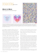
Decorative letterer Marian Bantjes creates Valentine’s cards every year. In 2011, she made a modular series (left) with ten variations, so that the recipients could treasure a few of their favorites and give others away. In the leftmost heart, she encrypted a message: “Remember when we were young, we used to give Valentines to all our friends.” Another obscured message appears in Bantjes’s poster for Australian wine maker R Wines: all of its suppliers are named (right). Bantjes drew 26 alphabetical grapes and 2 blanks, arranging them in Photoshop for a total of 2,130 grapes. She uses complexity to draw the viewer in “like a honey trap.”
Rebecca Huval
In the soggy heat of New Orleans in October, at the 2015 AIGA Design Conference, hundreds of the most brilliant minds in design converged to share their art, their souls and their business
cards. The heavily air-conditioned basement brimmed with display booths, and one featured a prompt on a Post-it: “Good design is...” Dozens of anonymous respondents stuck their considered memos underneath it to complete the sentence. The most common answer I saw: “Simple.” “Simple.” “Simple.” Good design is... simple.
Their way of thinking descends from a long tradition. “Less is more,” said legendary architect Ludwig Mies Van der Rohe. Shakespeare was more extreme: “Ornament is but the guild shore to a most dangerous sea.” Some go so far as to say simplicity is more ethical: “Virtue is like a rich stone—best plain set,” wrote Renaissance philosopher Francis Bacon.
To them I say, “Hogwash.” And in my mind, this word, hogwash, is illustrated by decorative letterer Marian Bantjes, with gold-foil swashes that loop around it like the intricate arabesques inside a mosque. The quotes above were collected in Bantjes’s book, titled I Wonder because that’s what decoration can do: make us feel like we see a god in the ornate designs of a cathedral’s stained glass, make us feel a sense of wonder.
Fine, let’s say the majority of good design is simple. Most of it doesn’t challenge us, inspire us, make us think hard or step outside our
worldview—but it’s efficient, without too much fuss, and enables us to go about our day. Then great design makes us feel wonder.
But here’s what I’m left wondering now: Why have so many designers settled for “good”? And why has ornamental design become the bogeyman?
Blame capitalism
Until the Victorian era, an ornamental product often signaled that its owner was wealthy. Intricate details were painstakingly carved, woven or painted by a human hand. Of course, this came at a premium. Ornaments adorned the palaces of India and Cambodia, the mosques of Turkey and Iran, the cathedrals of France and Spain—buildings meant to inspire awe. Filigree and flowers embellished luxury wall- paper and the premium typography found in books and storefronts.
With the industrial revolution in the 19th century, anyone could mass-produce decorative designs. As a result, poorly replicated designs made ornament look cheap, and designers balked at the garish taste surrounding them. In 1929, architect Adolpf Loos said, “The modern ornamental artist lags behind or is a pathological case.” Modernism preached the beauty of form following function: only the bare minimum was necessary, and the basic structure of an object was beautiful on its own.
Something similar happened to ornate designs online, as noted by designer and developer Dmitry Fadeyev in Smashing Magazine. We’ve
24 Illustration Annual 2016
