
Page 25 - Advertising Annual 55
P. 25
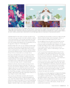
                  Dutch designer Richard Niessen’s poster The Masonic Lobby (left) is part of his series Palace of Typographic Masonry, which has been displayed in the Cooper Hewitt, Smithsonian Design Museum, in New York. The museum writes: “Floating puzzle pieces suggest a world of mystery that is about to come together— or drift further apart.” Commercial and interactive design has the potential to contain such mystery and complexity: the e-commerce website La Maison Des Carrés created by AKQA (usa.hermes.com/la-maison-des-carres.html) (right) features an ornate mansion occupied by Hermès products.
simplified websites in part because our former decorations now look tacky. In the 1990s, wacky GIFs and Flash animations exploded on your Internet browser as if Lisa Frank had animated the world encyclopedia. Yahoo! GeoCities enabled everyone to personalize their own homepage with haphazard unicorns that galloped across the page with a smug look of: “Grid? What grid?”
But all fun things must come to an end. “Having a GeoCities page basically became synonymous with dilettantism and bad taste,” writes Internet artist and theorist Olia Lialina. Now, instead of unicorns, spinning planets, roses and dolphins, we have sanitized and corporate-looking personal sites—Facebook, LinkedIn, about.me— that won’t let us run amok with our poor design choices.
“It feels gross and disgusting to say it out loud, but the death of Flash might actually be a bad thing for creativity,” writes tech journalist Owen Williams in an article titled “Web Design Is Now Completely Boring” on the Next Web. “Developers and designers loved Flash because it enabled audacious ideas that didn’t necessarily require huge amounts of coding knowledge.”
Between the Internet’s fancy-free birth and today, we’ve also gone from skeuomorphic design to flat design. In the 1990s, to acquaint people with their newfangled computers, skeuomorphic designers styled icons to look like real objects: trash cans, file folders, floppy disks. Shadows and details made applications look like they had dog-eared pages or distressed leather with stitched bindings. “Apple Calendar looked like a dog had just chewed on it,” jokes designer and writer Jeffrey Zeldman.
Then responsive and flat design rejected the silly real-world metaphors and instead focused on simplicity, typography and color—minus the shadows that give a page the illusion of depth. High-profile examples include Apple iOS7 in 2013 and Google Material Design in 2014. Fadeyev calls this “authentic” design in Smashing Magazine: “Authentic design is about representing function in its
most optimal form, about having a conviction in elegance through efficiency. Authentic design is about dropping the crutches of external ornament and finding beauty in pure content.”
The word efficiency is key, and captains of industry have latched onto it. Tech leaders such as Apple and Google (a.k.a. the fun police) have embraced minimalism with a vengeance. The benefits to simple web design are many: scalable, quickly iterative, faster to load at high resolutions and on retina screens, easier to understand at a glance, easier to do A/B testing on, and—most important—profitable.
“I miss the experimental feeling that design had ten years ago— not the shadows or the burlap, but just the idea that you never knew what you were going to get,” Zeldman says. “It was always in service of an idea. Now, there’s commodification pushing toward a frictionless consumer transaction. ... I don’t think that’s all design should be about. Right now, it kind of is.”
Letterer Jessica Hische, whose husband Russ Maschmeyer works as an interaction and product designer at Facebook, says, “We’re in an age of ‘templatizing’ too intensively, and people are afraid of deviating too much. In the tech industry, they’re very analytics focused, and it’s hard to analyze the happiness people get from your website. The slower way of going about things is not what people in tech look for—there’s not much of a slow Internet movement. But maybe there should be.”
Even though CEOs are finally saying they love design and are bringing more designers in-house, says Zeldman, everything looks the same regardless of which brand it is. “There’s nothing wrong with everything looking the same in terms of utility. If every site looked like Amazon, everyone would know how to shop at every site. But people don’t go into design to create experiences that have been created before or so as not to offend anyone—they go into it to surprise and to stir the heart.
Communication Arts | commarts.com 25
