Page 23 - print
P. 23
Video platform: a customizable, rich media solution | 22


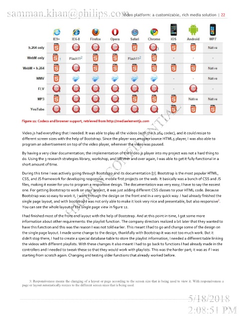
            Figure 11: Codecs and browser support, retrieved from http://mediaelementjs.com


            Video.js had everything that I needed. It was able to play all the videos (with the h.264 codec), and it could resize to
            different screen sizes with the help of Bootstrap. Since the player was an open source HTML5 player, I was also able to
            program an advertisement on top of the video player, whenever the video was paused.

            By having a very clear documentation; the implementation of the Video.js player into my project was not a hard thing to
            do. Using the 3 research strategies library, workshop, and lab over and over again, I was able to get it fully functional in a
            short amount of time.

            During this time I was actively going through Bootstrap and its documentation [7]. Bootstrap is the most popular HTML,
            CSS, and JS framework for developing responsive, mobile first projects on the web. It basically was a bunch of CSS and JS
            files, making it easier for you to program a responsive design. The documentation was very easy; I have to say the easiest
            one. For getting Bootstrap to work on your project, it was just adding different CSS classes to your HTML code. Because
            Bootstrap was so easy to work it, I went through the design on the front end in a very quick way. I had already finished the
                                                                                                              3
            single page layout, and with bootstrap I was not only able to make it look very nice and presentable, but also responsive .
            You can see the whole layout of the single page view in figure 12.

            I had finished most of the front end layout with the help of Bootstrap. And at this point in time, I got some more
            information about other requirements: the playlist function. The company directors realized a bit later that they wanted to
            have this function and this was the reason I was not told earlier. This meant I had to go and change some of the design on
            the single page layout. I made some change to the design, thankfully with Bootstrap it was not too much work. But it
            didn’t stop there, I had to create a special database table to store the playlist information; I needed a different table linking
            the videos with different playlists. With these changes it also meant I had to go back to functions I had already made in the
            controllers and I needed to tweak these so that they would work with playlists. This was the harder part; it was as if I was
            starting from scratch again. Changing and testing older functions that already worked before.


                3: Responsiveness means the changing of a layout or page according to the screen size that is being used to view it. With responsiveness a
            page or layout automatically resizes to the different screen sizes that is being used.

