
Page 16 - 1718_Futura Book_1-10_ChanKingYing_Kay_ebook
P. 16
ABOUT FUTURA
Characteristics of Futura
字體特色
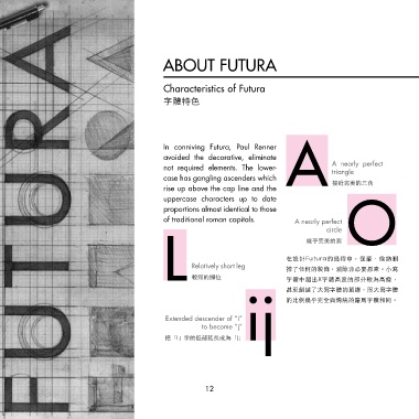
In conniving Futura, Paul Renner
avoided the decorative, eliminate
not required elements. The lower- A nearly perfect
triangle
case has gangling ascenders which
rise up above the cap line and the A 接近完美的三角
uppercase characters up to date
proportions almost identical to those
of traditional roman capitals. A nearly perfect O
circle
幾乎完美的圓
在設計Futura的過程中,保羅.倫納刪
Relatively short leg
掉了任何的裝飾,消除非必要原素。小寫
L 較短的腳位 字體中超出X字體高度的部分較為高瘦,
ij 的比例幾乎完全與傳統的羅馬字體相同。
甚至超越了大寫字體的頂線,而大寫字體
Extended descender of “i”
to become “j”
把「i」字的低部延長成為「j」
12