
Page 17 - 1718_Futura Book_1-10_ChanKingYing_Kay_ebook
P. 17
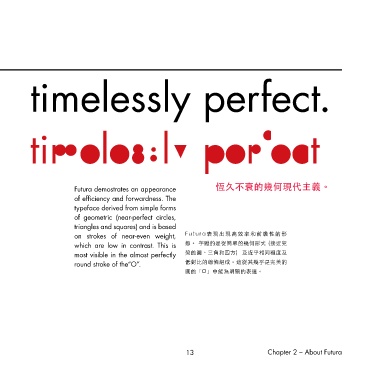
Futura demostrates an appearance          恆久不衰的幾何現代主義。
                       of efficiency and forwardness. The
                       typeface derived from simple forms
                       of geometric (near-perfect circles,
                       triangles and squares) and is based
                       on strokes of near-even weight,   Futura表現出現高效率和前瞻性的形
                       which are low in contrast. This is   態。 字體的是從簡單的幾何形式 (接近完
                       most visible in the almost perfectly   美的圓、三角和四方)  及近乎相同粗度及
                       round stroke of the“O”.          低對比的線條組成。這從其幾乎是完美的
                                                        圓的「O」中能為明顯的表達。


                                                         13                      Chapter 2 – About Futura