
Page 181 - The Power of Light, Colour and Sound for Health and Wellness draft
P. 181
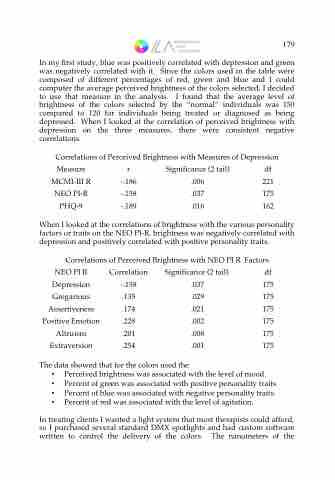
 In my frst study, blue was positively correlated with depression and green was negatively correlated with it. Since the colors used in the table were composed of different percentages of red, green and blue and I could computer the average perceived brightness of the colors selected, I decided to use that measure in the analysis. I found that the average level of brightness of the colors selected by the “normal” individuals was 150 compared to 120 for individuals being treated or diagnosed as being depressed. When I looked at the correlation of perceived brightness with depression on the three measures, there were consistent negative correlations.
Correlations of Perceived Brightness with Measures of Depression
Measure MCMI-III R NEO PI-R
r -.186 -.158
Signifcance (2 tail) df .006 221 .037 175 .016 162
PHQ-9 -.189
When I looked at the correlations of brightness with the various personality factors or traits on the NEO PI-R, brightness was negatively correlated with depression and positively correlated with positive personality traits.
Correlations of Perceived Brightness with NEO PI R Factors
NEO PI R Correlation Depression -.158
Signifcance (2 tail) df
Gregarious Assertiveness Positive Emotion Altruism Extraversion
.135 .174 .228 .201 .254
.037 .029 .021 .002 .008 .001
175
175
175
175
175
175
The data showed that for the colors used the
• Perceived brightness was associated with
• Percent of green was associated with positive personality traits.
• Percent of blue was associated with negative personality traits.
• Percent of red was associated with the level of agitation.
In treating clients I wanted a light system that most therapists could afford, so I purchased several standard DMX spotlights and had custom software written to control the delivery of the colors. The nanometers of the
the level of mood.
179
