
Page 21 - Demo
P. 21
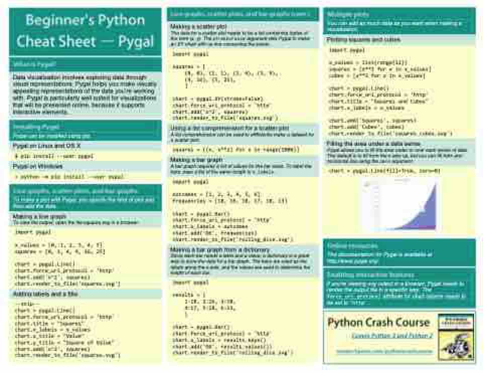
         Making a scatter plot
The data for a scatter plot needs to be a list containing tuples of the form (x, y). The stroke=False argument tells Pygal to make an XY chart with no line connecting the points.
     import pygal
squares = [
    (0, 0), (1, 1), (2, 4), (3, 9),
    (4, 16), (5, 25),
    ]
chart = pygal.XY(stroke=False)
chart.force_uri_protocol = 'http'
chart.add('x^2', squares)
chart.render_to_file('squares.svg')
      Using a list comprehension for a scatter plot
A list comprehension can be used to effficiently make a dataset for a scatter plot.
    squares = [(x, x**2) for x in range(1000)]
   Making a bar graph
A bar graph requires a list of values for the bar sizes. To label the bars, pass a list of the same length to x_labels.
   import pygal
outcomes = [1, 2, 3, 4, 5, 6]
frequencies = [18, 16, 18, 17, 18, 13]
chart = pygal.Bar()
chart.force_uri_protocol = 'http'
chart.x_labels = outcomes
chart.add('D6', frequencies)
chart.render_to_file('rolling_dice.svg')
      Making a bar graph from a dictionary
Since each bar needs a label and a value, a dictionary is a great way to store the data for a bar graph. The keys are used as the labels along the x-axis, and the values are used to determine the height of each bar.
     import pygal
results = {
    1:18, 2:16, 3:18,
    4:17, 5:18, 6:13,
    }
chart = pygal.Bar()
chart.force_uri_protocol = 'http'
chart.x_labels = results.keys()
chart.add('D6', results.values())
chart.render_to_file('rolling_dice.svg')
                > python –m pip install --user pygal
   To make a plot with Pygal, you specify the kind of plot and then add the data.
  Making a line graph
To view the output, open the file squares.svg in a browser.
     import pygal
x_values = [0, 1, 2, 3, 4, 5]
squares = [0, 1, 4, 9, 16, 25]
chart = pygal.Line()
chart.force_uri_protocol = 'http'
chart.add('x^2', squares)
chart.render_to_file('squares.svg')
      Adding labels and a title
     --snip--
chart = pygal.Line()
chart.force_uri_protocol = 'http'
chart.title = "Squares"
chart.x_labels = x_values
chart.x_title = "Value"
chart.y_title = "Square of Value"
chart.add('x^2', squares)
chart.render_to_file('squares.svg')
                 Data visualization involves exploring data through visual representations. Pygal helps you make visually appealing representations of the data you’re working with. Pygal is particularly well suited for visualizations that will be presented online, because it supports interactive elements.
     Pygal can be installed using pip.
    Pygal on Linux and OS X
    $ pip install --user pygal
    Pygal on Windows
                            You can add as much data as you want when making a visualization.
   Plotting squares and cubes
     import pygal
x_values = list(range(11))
squares = [x**2 for x in x_values]
cubes = [x**3 for x in x_values]
chart = pygal.Line()
chart.force_uri_protocol = 'http'
chart.title = "Squares and Cubes"
chart.x_labels = x_values
chart.add('Squares', squares)
chart.add('Cubes', cubes)
chart.render_to_file('squares_cubes.svg')
      Filling the area under a data series
Pygal allows you to fill the area under or over each series of data. The default is to fill from the x-axis up, but you can fill from any horizontal line using the zero argument.
     chart = pygal.Line(fill=True, zero=0)
        The documentation for Pygal is available at http://www.pygal.org/.
 If you’re viewing svg output in a browser, Pygal needs to render the output file in a specific way. The force_uri_protocol attribute for chart objects needs to be set to 'http'.
     Covers Python 3 and Python 2
