
Page 19 - Demo
P. 19
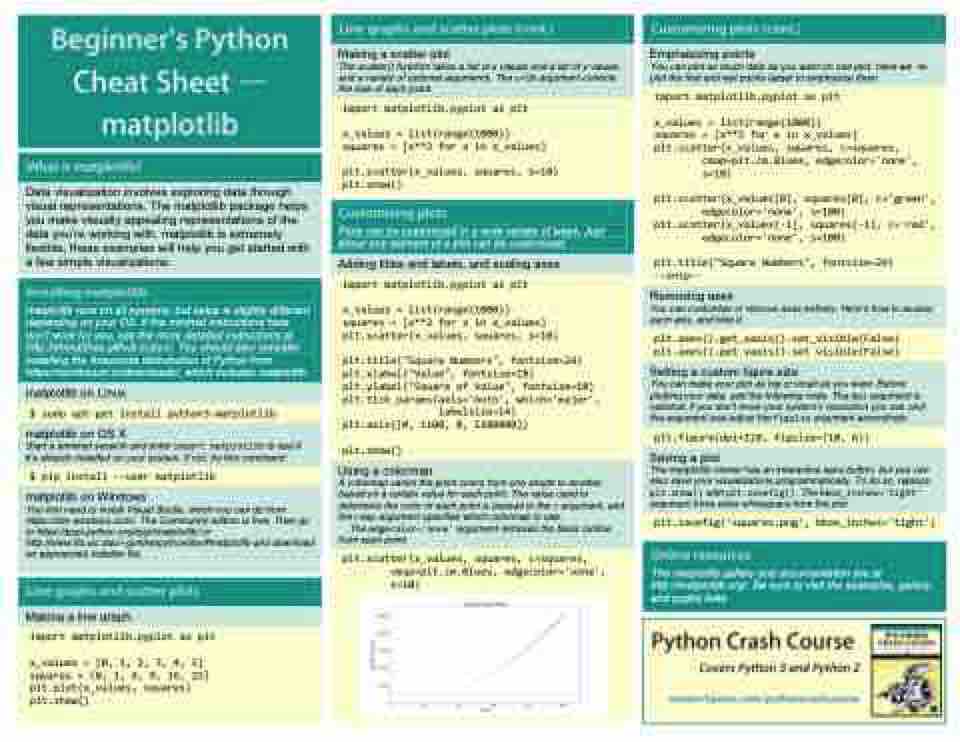
          Making a scatter plot
The scatter() function takes a list of x values and a list of y values, and a variety of optional arguments. The s=10 argument controls the size of each point.
 about any element of a plot can be customized.
  Adding titles and labels, and scaling axes
    import matplotlib.pyplot as plt
x_values = list(range(1000))
squares = [x**2 for x in x_values]
plt.scatter(x_values, squares, s=10)
plt.title("Square Numbers", fontsize=24)
plt.xlabel("Value", fontsize=18)
plt.ylabel("Square of Value", fontsize=18)
plt.tick_params(axis='both', which='major',
                labelsize=14)
plt.axis([0, 1100, 0, 1100000])
plt.show()
  Using a colormap
 A colormap varies the point colors from one shade to another, based on a certain value for each point. The value used to determine the color of each point is passed to the c argument, and the cmap argument specifies which colormap to use.
The edgecolor='none' argument removes the black outline from each point.
     plt.scatter(x_values, squares, c=squares,
        cmap=plt.cm.Blues, edgecolor='none',
        s=10)
        Emphasizing points
You can plot as much data as you want on one plot. Here we re- plot the first and last points larger to emphasize them.
     import matplotlib.pyplot as plt
x_values = list(range(1000))
squares = [x**2 for x in x_values]
plt.scatter(x_values, squares, c=squares,
        cmap=plt.cm.Blues, edgecolor='none',
        s=10)
plt.scatter(x_values[0], squares[0], c='green',
        edgecolor='none', s=100)
plt.scatter(x_values[-1], squares[-1], c='red',
        edgecolor='none', s=100)
plt.title("Square Numbers", fontsize=24)
--snip--
    Removing axes
You can customize or remove axes entirely. Here’s how to access each axis, and hide it.
   plt.axes().get_xaxis().set_visible(False)
plt.axes().get_yaxis().set_visible(False)
      Setting a custom figure size
You can make your plot as big or small as you want. Before plotting your data, add the following code. The dpi argument is optional; if you don’t know your system’s resolution you can omit the argument and adjust the figsize argument accordingly.
     plt.figure(dpi=128, figsize=(10, 6))
      Saving a plot
The matplotlib viewer has an interactive save button, but you can also save your visualizations programmatically. To do so, replace plt.show() with plt.savefig(). The bbox_inches='tight' argument trims extra whitespace from the plot.
     plt.savefig('squares.png', bbox_inches='tight')
      The matplotlib gallery and documentation are at http://matplotlib.org/. Be sure to visit the examples, gallery, and pyplot links.
                        import matplotlib.pyplot as plt
x_values = list(range(1000))
squares = [x**2 for x in x_values]
plt.scatter(x_values, squares, s=10)
plt.show()
             Data visualization involves exploring data through visual representations. The matplotlib package helps you make visually appealing representations of the data you’re working with. matplotlib is extremely flexible; these examples will help you get started with a few simple visualizations.
     Plots can be customized in a wide variety of ways. Just
            matplotlib runs on all systems, but setup is slightly different depending on your OS. If the minimal instructions here don’t work for you, see the more detailed instructions at http://ehmatthes.github.io/pcc/. You should also consider installing the Anaconda distrubution of Python from https://continuum.io/downloads/, which includes matplotlib.
     matplotlib on Linux
   $ sudo apt-get install python3-matplotlib
    matplotlib on OS X
Start a terminal session and enter import matplotlib to see if it’s already installed on your system. If not, try this command:
      $ pip install --user matplotlib
     matplotlib on Windows
You first need to install Visual Studio, which you can do from https://dev.windows.com/. The Community edition is free. Then go to https://pypi.python.org/pypi/matplotlib/ or http://www.lfd.uic.edu/~gohlke/pythonlibs/#matplotlib and download an appropriate installer file.
       Making a line graph
     import matplotlib.pyplot as plt
x_values = [0, 1, 2, 3, 4, 5]
squares = [0, 1, 4, 9, 16, 25]
plt.plot(x_values, squares)
plt.show()
             Covers Python 3 and Python 2
