
Page 20 - 3D Artist 110 - 2017 UK
P. 20
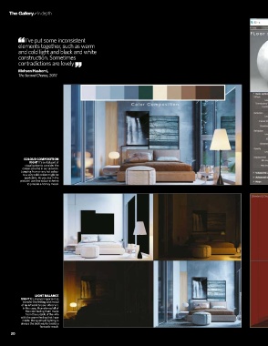
I’ve put some inconsistent
          elements together, such as warm
          and cold light and black and white
          construction. Sometimes
          contradictions are lovely

          Mohsen Hashemi,
          The Second Chance, 2017


             COLOUR COMPOSITION
               rigHT It’s a vital part of
             visualisation to consider the
            colour scheme in our artwork.
           Jumping from a very hot colour
            to a very cold colour might be
             applicable. As you see in the
           picture I use this colour scheme
              to provide a homey mood.


                  LIGHT BALANCE
           rigHT It’s always important to
            transfer the feeling and mood
           of an artwork to your observer.
            In this case, I transferred all of
              the cold feeling that I made
              from the outside of the villa
           with the warm feeling that I use
            inside. Using simple lighting is
           always the best way to create a
                    fantastic result.
      20
      20