
Page 4 - Brand Guidelines
P. 4
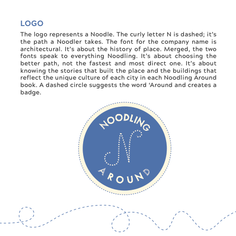
LOGO
The logo represents a Noodle. The curly letter N is dashed; it’s the path a Noodler takes. The font for the company name is architectural. It’s about the history of place. Merged, the two fonts speak to everything Noodling. It’s about choosing the better path, not the fastest and most direct one. It’s about knowing the stories that built the place and the buildings that reflect the unique culture of each city in each Noodling Around book. A dashed circle suggests the word ‘Around and creates a badge.
   o
o
d
l
i
n
n
g
d
a
n
u
r
o
