
Page 5 - Brand Guidelines
P. 5
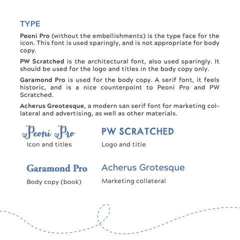
TYPE
Peoni Pro (without the embellishments) is the type face for the icon. This font is used sparingly, and is not appropriate for body copy.
PW Scratched is the architectural font, also used sparingly. It should be used for the logo and titles in the body copy only.
Garamond Pro is used for the body copy. A serif font, it feels historic, and is a nice counterpoint to Peoni Pro and PW Scratched.
Acherus Greotesque, a modern san serif font for marketing col- lateral and advertising, as well as other materials.
Peoni o
Icon and titles
Garamond Pro
Body copy (book)
PW Scratched
Logo and title
Acherus Grotesque
Marketing collateral
