Page 189 - MS Office 365 for Dummies 3rd Ed (2019)
P. 189
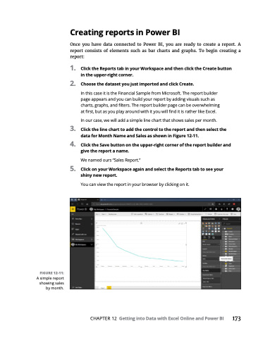
 FIGURE 12-11:
A simple report showing sales by month.
Creating reports in Power BI
Once you have data connected to Power BI, you are ready to create a report. A report consists of elements such as bar charts and graphs. To begin creating a report:
1. ClicktheReportstabinyourWorkspaceandthenclicktheCreatebutton in the upper-right corner.
2. ChoosethedatasetyoujustimportedandclickCreate.
In this case it is the Financial Sample from Microsoft. The report builder page appears and you can build your report by adding visuals such as charts, graphs, and filters. The report builder page can be overwhelming at first, but as you play around with it you will find it is rather like Excel.
In our case, we will add a simple line chart that shows sales per month.
3. Clickthelinecharttoaddthecontroltothereportandthenselectthe data for Month Name and Sales as shown in Figure 12-11.
4. ClicktheSavebuttonontheupper-rightcornerofthereportbuilderand give the report a name.
We named ours “Sales Report.”
5. ClickonyourWorkspaceagainandselecttheReportstabtoseeyour shiny new report.
You can view the report in your browser by clicking on it.
CHAPTER12 GettingintoDatawithExcelOnlineandPowerBI 173


