
Page 39 - Marine Magnetometer Processing
P. 39
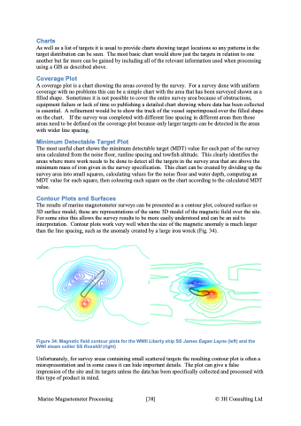
Charts As well as a list of targets it is usual to provide charts showing target locations so any patterns in the target distribution can be seen. The most basic chart would show just the targets in relation to one another but far more can be gained by including all of the relevant information used when processing using a GIS as described above. Coverage Plot A coverage plot is a chart showing the areas covered by the survey. For a survey done with uniform coverage with no problems this can be a simple chart with the area that has been surveyed shown as a filled shape. Sometimes it is not possible to cover the entire survey area because of obstructions, equipment failure or lack of time so publishing a detailed chart showing where data has been collected is essential. A refinement would be to show the track of the vessel superimposed over the filled shape on the chart. If the survey was completed with different line spacing in different areas then those areas need to be defined on the coverage plot because only larger targets can be detected in the areas with wider line spacing. Minimum Detectable Target Plot The most useful chart shows the minimum detectable target (MDT) value for each part of the survey area calculated from the noise floor, runline spacing and towfish altitude. This clearly identifies the areas where more work needs to be done to detect all the targets in the survey area that are above the minimum mass of iron given in the survey specification. This chart can be created by dividing up the survey area into small squares, calculating values for the noise floor and water depth, computing an MDT value for each square, then colouring each square on the chart according to the calculated MDT value. Contour Plots and Surfaces The results of marine magnetometer surveys can be presented as a contour plot, coloured surface or 3D surface model; these are representations of the same 3D model of the magnetic field over the site. For some sites this allows the survey results to be more easily understood and can be an aid to interpretation. Contour plots work very well when the size of the magnetic anomaly is much larger than the line spacing, such as the anomaly created by a large iron wreck (Fig. 34). Figure 34: Magnetic field contour plots for the WWII Liberty ship SS James Eagan Layne (left) and the WWI steam collier SS Rosehill (right) Unfortunately, for survey areas containing small scattered targets the resulting contour plot is often a misrepresentation and in some cases it can hide important details. The plot can give a false impression of the site and its targets unless the data has been specifically collected and processed with this type of product in mind. Marine Magnetometer Processing \[38\] © 3H Consulting Ltd
