
Page 6 - The Hollows Marketing Initiatives
P. 6
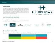
BRANDING
PRIMARY LOGO:
The logo is the staple of the brand and preferred on light backgrounds. It symbolizes water, growth and strength. The seal represents Lake Travis and depicts the forward movement the community will provide. Within the “H” are three waves that are bold in weight and highlight the crossbar. The wordmark is simple and legible, but is packed with visual interest by connecting a historic lake uppercase font with a bold secondary font.
COMPLEMENTARY LOGO VARIATIONS:
The design for The Hollows will be a combination of fun, lake and community. Although bright and colorful, the brand will be mindful to stay sophisticated and contemporary to maintain a high-quality look and feel.
PMS U 316
PMS C 316
PMS U 319 PMS C 319 WEB #3AC0CB
C 66
PMS U 3125 PMS C 3125 WEB #00ABC8
C 75
WEB #014650
BRAND COLORS: Energetic and Bright
C 94
R 1
R 58
R 0
It is important for the color scheme to support the brand expression. Our goal is for The Hollows to make our homeowner’s feel renewed and
G 71 M 0 G 193
energized. The bright palette is to resemble a perfect sunny day where all in the world, just feels right.
G 171 B 200
M 58 Y 53 K 38
B 81
Y 22 K0
C 66
M 0
PY M2 2S U 1 1 4
B 204
M 11 Y 17 K0
C 75
M 11
PY M1 7 S U W a r m R e d B 2 0 0
316 316
014650
PMS U 319 PMS C 319 WEB #3AC0CB
PMS U 3125 PMS C 3125 WEB #00ABC8
PMS U PMS C WEB #
M 58
R 1
G 71
R 58 G 193 B 2 0 4
R 0
5
C 94
THE HOLLOWS ON LAKE TRAVIS
G 171
P M S U 3 6 7 B 8 1 Y 53
