Page 185 - Visual Marketing
P. 185
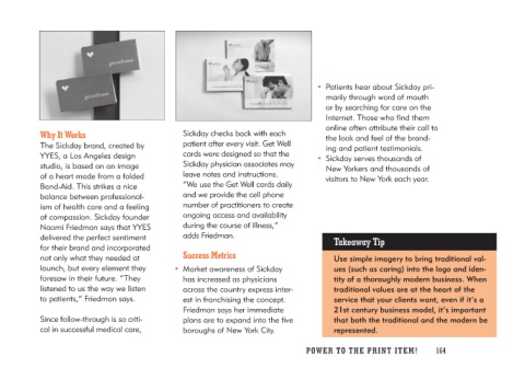
Why It Works                          Sickday checks back with each        • Patients hear about Sickday pri-
                                      patient after every visit. Get Well     marily through word of mouth
The Sickday brand, created by         cards were designed so that the         or by searching for care on the
YYES, a Los Angeles design            Sickday physician associates may        Internet. Those who find them
studio, is based on an image          leave notes and instructions.           online often attribute their call to
of a heart made from a folded         “We use the Get Well cards daily        the look and feel of the brand-
Band-Aid. This strikes a nice         and we provide the cell phone           ing and patient testimonials.
balance between professional-         number of practitioners to create
ism of health care and a feeling      ongoing access and availability      • Sickday serves thousands of
of compassion. Sickday founder        during the course of illness,”          New Yorkers and thousands of
Naomi Friedman says that YYES         adds Friedman.                          visitors to New York each year.
delivered the perfect sentiment
for their brand and incorporated     Success Metrics                           Takeaway Tip
not only what they needed at
launch, but every element they     • Market awareness of Sickday                 Use simple imagery to bring traditional val-
foresaw in their future. “They        has increased as physicians                ues (such as caring) into the logo and iden-
listened to us the way we listen      across the country express inter-          tity of a thoroughly modern business. When
to patients,” Friedman says.          est in franchising the concept.            traditional values are at the heart of the
                                      Friedman says her immediate                service that your clients want, even if it’s a
Since follow-through is so criti-     plans are to expand into the five           21st century business model, it’s important
cal in successful medical care,       boroughs of New York City.                 that both the traditional and the modern be
                                                                                 represented.

                                                                           PO WER TO THE PR I N T I TE M ! 164

