Page 181 - Visual Marketing
P. 181
Why It Works                         and social while still clearly         website and brand as the rea-
                                     branded as Ditto & Co.,” says          son she was interviewed by the
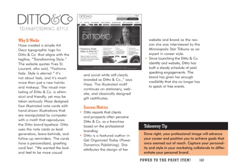
Hase created a simple Art            Hase. The illustrated motif            Minneapolis Star Tribune as an
Deco typographic logo for            continues on stationery, web-          expert in career style.
Ditto & Co. that aligns with the     site, and classically designed      • Since launching the Ditto & Co.
tagline, “Transforming Style.”       gift certificates.                      identity and website, Ditto has
The website quotes Yves St.                                                 built a steady schedule of paid
Laurent, who said, “Fashions        Success Metrics                         speaking engagements. The
fade. Style is eternal.” It’s                                               brand has given her enough
not about fads, and it’s much     • Ditto reports that clients              credibility that she no longer has
more than just a new hairdo          and prospects often perceive           to speak at free events.
and makeup. The visual mar-          Ditto & Co. as a franchise
keting of Ditto & Co. is whim-       based on the professional         Takeaway Tip
sical and friendly, yet may be       branding.
taken seriously. Hase designed                                          Done right, your professional image will advance
four illustrated note cards with  • Ditto is a featured author in       your career and position you to achieve goals that
hand-drawn illustrations that        Get Organized Today (Power         once seemed out of reach. Capture your personal-
are manipulated by computer          Dynamics Publishing). She          ity and style in your marketing collaterals to differ-
with a motif that reproduces         attributes the design of her       entiate your personal brand.
the Ditto brand typeface. Ditto                                      PO WER TO THE PR I N T I TE M ! 160
uses the note cards as lead
generators, leave-behinds, and
follow-up reminders. The cards
have a personalized, greeting
card feel. “We wanted the look
and feel to be more casual

