Page 177 - Visual Marketing
P. 177
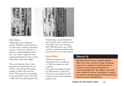
Why It Works                          bright images, guaranteeing the
                                      eye will never have a dull moment.
Thicker than most conference          And while many may not hang
guides, TEDIndia’s book features      their TEDIndia poster up on their
an open spine, making note taking     wall, the engineering of the poster-
easier; a cover that converts to a    turned-book-cover is sheer genius.
poster for added keepsake poten-
tial; and “secret” edge-trim mes-       Success Metrics                     Takeaway Tip
saging guaranteed to make owners
of the book smile with delight.       • TEDIndia’s first and only            Branding doesn’t always translate globally.
                                         event had sold-out audiences       What was once a concern of large companies
The cover features slices of pho-        of 1,000 attendees from 46         only is now a matter for small businesses to
tographs and digitized photos of         countries.                         consider as more and more operate as
Indians. Since people like seeing                                           “micro-multinationals.” By taking a fresh look
images of others who look like        • The event successfully brought      from a different country’s perspective, a brand
them, TED succeeds in translating        the TED brand to South Asia.       can adapt its existing design with local elements
its brand locally in India. The book                                        that are inclusive and effective.
is filled with color photographs and   • The book is considered by TED
                                         to be one of its most successful
                                         guides so far.

                                                                           PO WER TO THE PR I N T I TE M ! 156

