Page 175 - Visual Marketing
P. 175
Why It Works                        coordinated campaign included
                                    Twitter and a dedicated website
The identity needed to be           that fueled word-of-mouth.
uniquely “Omaha,” while con-
veying the conference’s core        Davies says, “The brand itself       • The Big Omaha posters
intent: bringing this key audience  plays on the whimsicalness              received design awards from
to the city. The creative team      of the event, and that carries          the Nebraska chapter of the
considered meatpacking, corn,       through down to the tiniest             AIGA and Communications Arts
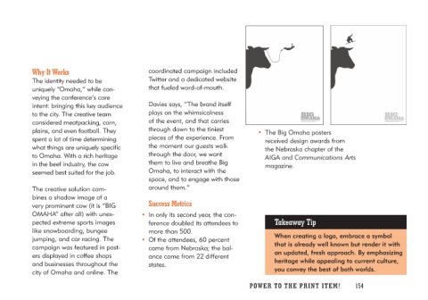
plains, and even football. They     pieces of the experience. From          magazine.
spent a lot of time determining     the moment our guests walk
what things are uniquely specific    through the door, we want
to Omaha. With a rich heritage      them to live and breathe Big
in the beef industry, the cow       Omaha, to interact with the
seemed best suited for the job.     space, and to engage with those
                                    around them.”
The creative solution com-
bines a shadow image of a             Success Metrics                    Takeaway Tip
very prominent cow (it is “BIG
OMAHA” after all) with unex-        • In only its second year, the con-  When creating a logo, embrace a symbol
pected extreme sports images           ference doubled its attendees to  that is already well known but render it with
like snowboarding, bungee              more than 500.                    an updated, fresh approach. By emphasizing
jumping, and car racing. The                                             heritage while appealing to current culture,
campaign was featured in post-      • Of the attendees, 60 percent       you convey the best of both worlds.
ers displayed in coffee shops          came from Nebraska; the bal-
and businesses throughout the          ance came from 22 different
city of Omaha and online. The          states.

                                                                         PO WER TO THE PR I N T I TE M ! 154

