Page 115 - FULL REPORT 30012024
P. 115
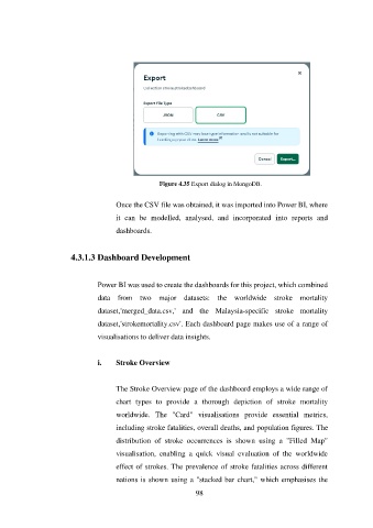
Figure 4.35 Export dialog in MongoDB.


                                      Once the CSV file was obtained, it was imported into Power BI, where
                                      it  can  be  modelled,  analysed,  and  incorporated  into  reports  and

                                      dashboards.


                        4.3.1.3 Dashboard Development


                                Power BI was used to create the dashboards for this project, which combined
                                data  from  two  major  datasets:  the  worldwide  stroke  mortality

                                dataset,'merged_data.csv,'  and  the  Malaysia-specific  stroke  mortality

                                dataset,'strokemortality.csv'. Each dashboard page makes use of a range of
                                visualisations to deliver data insights.


                                i.    Stroke Overview


                                      The Stroke Overview page of the dashboard employs a wide range of
                                      chart  types  to  provide  a  thorough  depiction  of  stroke  mortality

                                      worldwide.  The  "Card"  visualisations  provide  essential  metrics,
                                      including stroke fatalities, overall deaths, and population figures. The

                                      distribution  of  stroke  occurrences  is  shown  using  a  "Filled  Map"

                                      visualisation,  enabling  a  quick  visual  evaluation  of  the  worldwide
                                      effect of strokes. The prevalence of stroke fatalities across different

                                      nations is shown using a "stacked bar chart," which emphasises the
                                                               98

