Page 116 - FULL REPORT 30012024
P. 116
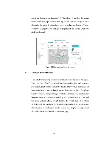
countries that are most impacted. A "line chart" is used to document

                                      trends over time, specifically tracking stroke fatalities by year. This

                                      allows for the identification of past patterns and the prediction of future
                                      occurrences. Figure 4.36 displays a snapshot of the Stroke Overview

                                      dashboard panel.


                                                       Figure 4.36 Screenshot of Overview page.


                               ii.    Malaysia Stroke Statistic


                                      This article specifically focuses its attention on the nation of Malaysia.
                                      This  page  has  "Card"  visualisations  that  provide  data  such  average

                                      population, total deaths, and stroke deaths. Moreover, a narrative part

                                      is provided to give a textual explanation of the data, while a "Doughnut
                                      Chart" visualises the percentage of stroke fatalities. The relationship

                                      between stroke mortality and smoking is examined using a "Line and
                                      Clustered Column Chart," which displays the overall number of stroke

                                      fatalities with the number of individuals who smoke daily, emphasising
                                      the influence of smoking on health. Figure 4.37 displays a snapshot of

                                      the Malaysia Stroke Statistics dashboard page.


                                                               99

