Page 37 - FULL REPORT 30012024
P. 37
2.4.1  Charts


                                i.     Line Chart


                                       A  line  chart  is  used  to  illustrate  the  dependence  or  relationship
                                       between two variables. It assists us in recognising patterns, trends,

                                       and  fluctuations  within  your  data.  It  can  also  be  used  to  compare

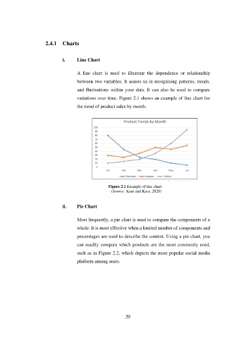
                                       variations over time. Figure 2.1 shows an example of line chart for
                                       the trend of product sales by month.


                                                       Figure 2.1 Example of line chart
                                                        (Source: Kaur and Kaur, 2020)


                                ii.    Pie Chart


                                       Most frequently, a pie chart is used to compare the components of a

                                       whole. It is most effective when a limited number of components and
                                       percentages are used to describe the content. Using a pie chart, you

                                       can readily compare which products are the most commonly used,

                                       such as in Figure 2.2, which depicts the most popular social media
                                       platform among users.


                                                               20

