Page 40 - FULL REPORT 30012024
P. 40
2.4.3  Big Data Visualization


                                Big Data refers to this massive volume of generated data. To visualise large
                                data, novel and more interactive data visualisation techniques are proposed.

                                Following are some techniques to visualise large data.


                                i.     Box plot


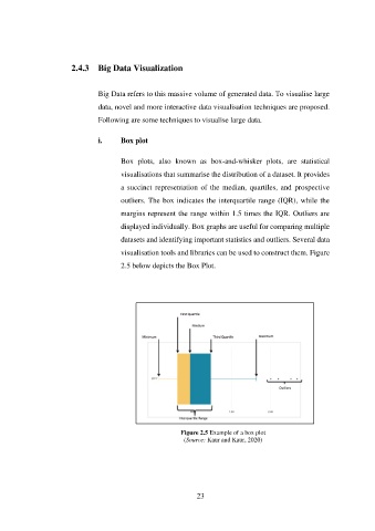
                                       Box  plots,  also  known  as  box-and-whisker  plots,  are  statistical

                                       visualisations that summarise the distribution of a dataset. It provides
                                       a succinct representation  of the median, quartiles,  and  prospective

                                       outliers. The box indicates the interquartile range (IQR), while the
                                       margins represent the range within 1.5 times the IQR. Outliers are

                                       displayed individually. Box graphs are useful for comparing multiple

                                       datasets and identifying important statistics and outliers. Several data
                                       visualisation tools and libraries can be used to construct them. Figure

                                       2.5 below depicts the Box Plot.


                                                          Figure 2.5 Example of a box plot
                                                           (Source: Kaur and Kaur, 2020)


                                                               23

