Page 93 - FULL REPORT 30012024
P. 93
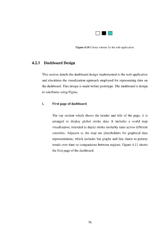
Figure 4.10 Colour scheme for the web application.


                        4.2.3  Dashboard Design


                               This section details the dashboard design implemented in the web application

                               and elucidates the visualization approach employed for representing data on
                               the dashboard. This design is made before prototype. The dashboard is design

                               in wireframe using Figma.


                               i.     First page of dashboard


                                      The top  section  which shows the header and title of the page, it  is

                                      arranged  to  display  global  stroke  data.  It  includes  a  world  map
                                      visualization, intended to depict stroke mortality rates across different

                                      countries.  Adjacent  to  the  map  are  placeholders  for  graphical  data
                                      representations, which includes bar graphs and line charts to portray

                                      trends over time or comparisons between regions. Figure 4.11 shows

                                      the first page of the dashboard.


                                                               76

