
Page 118 - A Complete Guide to Volume Price Analysis: Read the book then read the market
P. 118
Market, written in 1994. The concept is one in which volume is considered to be more important than time, and as such the X axis of the chart is
replaced with volume, whilst the Y axis remains as before with price. The principle idea is that in adopting this approach in presenting the price and
volume relationship on the chart, this emphasizes the relationship, with volume moving to the chart itself, where it joins price, rather than as an
isolated indicator at the bottom of the chart. As a result, and with the change in the X axis from time, to volume, the ‘time’ element is removed and
the focus is then solely on the volume price relationship.
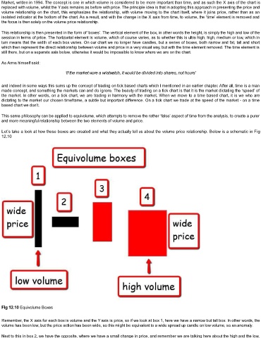
This relationship is then presented in the form of ‘boxes’. The vertical element of the box, in other words the height, is simply the high and low of the
session in terms of price. The horizontal element is volume, which of course varies, as to whether this is ultra high, high, medium or low, which in
turn means that the width of each box varies. On our chart we no longer have candles, but a series of boxes, both narrow and fat, tall and short
which then represent the direct relationship between volume and price in a very visual way, but with the time element removed. The time element is
still there, but on a separate axis below, otherwise it would be impossible to know where we are on the chart.
As Arms himself said:
‘if the market wore a wristwatch, it would be divided into shares, not hours’
and indeed in some ways this sums up the concept of trading on tick based charts which I mentioned in an earlier chapter. After all, time is a man
made concept, and something the markets can and do ignore. The beauty of trading on a tick chart is that it is the market dictating the ‘speed’ of
the market. In other words, on a tick chart, we are trading in harmony with the market. When we move to a time based chart, it is we who are
dictating to the market our chosen timeframe, a subtle but important difference. On a tick chart we trade at the speed of the market - on a time
based chart we don’t.
This same philosophy can be applied to equivolume, which attempts to remove the rather ‘false’ aspect of time from the analysis, to create a purer
and more meaningful relationship between the two elements of volume and price.
Let’s take a look at how these boxes are created and what they actually tell us about the volume price relationship. Below is a schematic in Fig
12.10
Fig 12.10 Equivolume Boxes
Remember, the X axis for each box is volume and the Y axis is price, so if we look at box 1, here we have a narrow but tall box. In other words, the
volume has been low, but the price action has been wide, so this might be equivalent to a wide spread up candle on low volume, so an anomaly.
Next to this in box 2, we have the opposite, where we have a small change in price, and remember we are talking here about the high and the low,