
Page 16 - Caitlin Cole_Finley
P. 16
BRAND IDENTITY PROPOSAL 27
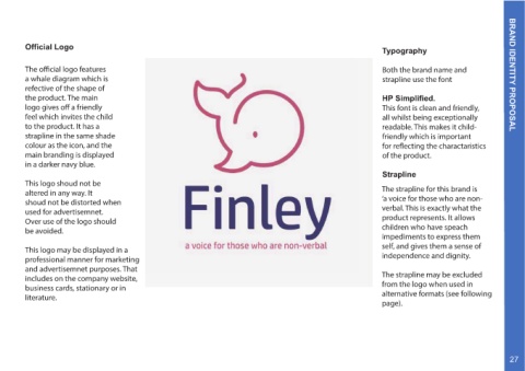
Typography Both the brand name and strapline use the font HP Simplified. This font is clean and friendly, all whilst being exceptionally readable. This makes it child- friendly which is important for reflecting the charactaristics of the product. Strapline The strapline for this brand is ‘a voice for those who are non- verbal. This is exactly what the product represents. It allows children who have speach impediments to express them self, and gives them a sense of independence and dignity. The strapline may be excluded from the logo when used in alternative formats (see following page).
Official Logo The official logo features a whale diagram which is refective of the shape of the product. The main logo gives off a friendly feel which invites the child to the product. It has a strapline in the same shade colour as the icon, and the main branding is displayed in a darker navy blue. This logo shoud not be altered in any way. It shoud not be distorted when used for advertisemnet. Over use of the logo should be avoided. This logo may be displayed in a professional manner for marketing and advertisemnet purposes. That includes on the company website, business cards, stationary or in literature.