Page 76 - PAM - PROOF
P. 76
V 1.1 February 2024

               Gutenslider
               While we are in photo mode it’s a good time to look at the Gutenslider block.
               You did see this on your training demo site Welcome page and it has been
               mentioned but not explained.  This is a fabulous block that can really add impact
               to a page.  It is very easy but very effective.

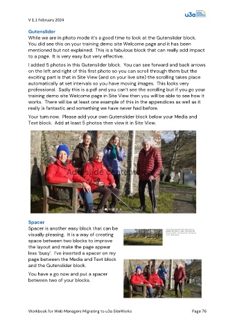
               I added 5 photos in this Gutenslider block.  You can see forward and back arrows
               on the left and right of this first photo so you can scroll through them but the
               exciting part is that in Site View (and on your live site) the scrolling takes place
               automatically at set intervals so you have moving images.  This looks very
               professional.  Sadly this is a pdf and you can’t see the scrolling but if you go your
               training demo site Welcome page in Site View then you will be able to see how it
               works.  There will be at least one example of this in the appendices as well as it
               really is fantastic and something we have never had before.

               Your turn now.  Please add your own Gutenslider block below your Media and
               Text block.  Add at least 5 photos then view it in Site View.


               Spacer
               Spacer is another easy block that can be
               visually pleasing.  It is a way of creating
               space between two blocks to improve
               the layout and make the page appear
               less ‘busy’.  I’ve inserted a spacer on my
               page between the Media and Text block
               and the Gutenslider block.

               You have a go now and put a spacer
               between two of your blocks.


               Workbook for Web Managers Migrating to u3a SiteWorks                               Page 76

