Page 17 - Upward Bound Plansbook_Final Copy_Neat
P. 17
U P W A R D   B O U N D


                         VISUAL/VERBAL ELEMENTS


                                                                                               Throughout this campaign, the
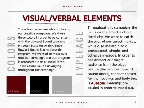
                    The colors below are what makes up

                    our creative campaign. We chose                                       E    focus on the brand is about

                 S  these colors in order to be consistent                                C    simplicity. We want to catch

                    with the Upward Bound logo and                                             the eyes of our target market,
                 R  Missouri State University. Since                                      A    while also maintaining a


                 O  Upward Bound is a nationwide                                          F    professional, simple, and
                    program, we wanted to make sure
                 L  that our campaign and our program                                     E    cohesive message. In order to
                                                                                               not distract our target
                 O  is recognizable as Missouri State.                                    P    audience from the bigger

                    These colors will be unvarying
                 C  throughout the campaign.                                              Y    picture (the services Upward

                                                                                          T    Bound offers), the font chosen

                                                                                               for the headings and body text

                                                                                               is ABeeZee. Headings are

                                                                                               bolded in order to stand out.

         #5d0008                  #000000                  #a6a6a6


                                                             V I S U A L / V E R B A L   E L E M E N T S                                       17

