Page 220 - 20230703_IGAI_MNG_Prototipo
P. 220
Introduction

                                                      Use of colour and typography

                                                      for the Policies


            Policy areas can choose any colour to aquire a degree of distinction within
            the corporate look and feel. There is, however, no exclusivity regarding the
            choice of colours, that means that a colour can be chosen by more than
            one Directorate General.

            The footer box does not refer only to policies. It can also contain
            the name of an EU programme, a political initiative, an event etc.

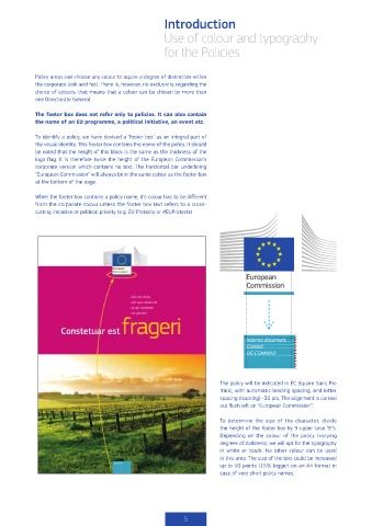
            To identify a policy, we have devised a ‘footer box’ as an integral part of
            the visual identity. This footer box contains the name of the policy. It should
            be noted that the height of this block is the same as the thickness of the
            logo flag. It is therefore twice the height of the European Commission’s
            corporate version which contains no text. The horizontal bar underlining
            “European Commission” will always be in the same colour as the footer box
            at the bottom of the page.

            When the footer box contains a policy name, it’s colour has to be different
            from the corporate colour unless the footer box text refers to a cross-
            cutting initiative or political priority (e.g. EU Protects or #EUProtects)


                                                                                Internal document  E E
                                                                                Contact:       E E
                                                                                DG COMM/A3     E E
                                                                                               E
                                                                                               E
                                                                                               E

                                                                       The policy will be indicated in EC Square Sans Pro
                                                                       Italic, with automatic leading spacing, and letter
                                                                       spacing (tracking) -30 pts. The alignment is carried
                                                                       out flush left on “European Commission”.


                                                                       To determine the size of the character, divide
                                                                       the height of the footer box by 9 upper case “E”s.
                                                                       Depending on the colour of the policy (varying
                                                                       degrees of darkness), we will opt for the typography
                                                                       in white or black. No other colour can be used
                                                                       in this area. The size of the text could be increased
                                                                       up to 10 points (15% bigger) on an A4 format in
                                                                       case of very short policy names.


                                                            5

