Page 218 - 20230703_IGAI_MNG_Prototipo
P. 218
Introduction

                                                      Basic principles


            3. The typographies:                             4. The top banner of the document:

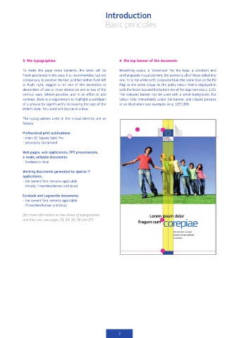
            To  make  the  page  more  dynamic,  the  texts  will  be   Breathing  space,  a  ‘showcase’  for  the  logo,  a  constant  and
            freely positioned in the area. It is recommended, but not   unchangeable visual element, the banner is all of these rolled into
            compulsory, to position the text justified (either flush left   one. It can be white or EC corporate blue (the same blue as the EU
            or  flush  right,  ragged  or  on  one  of  the  ascenders  or     flag) or the same colour as the policy colour that is displayed in
            descenders of one or more letters) on one or two of the    both the footer box and the bottom line of the logo (see also p. 110).
            vertical axes. Where possible, and in an effort to add   The coloured banner can be used with a white background, flat
            contrast, there is a requirement to highlight a word/part   colour tints immediately under the banner, and clipped pictures
            of a phrase by significantly increasing the size of the   or an illustration (see examples on p. 167,168).
            letter’s body. This word will also be in colour.

            The typographies used in the visual identity are as
            follows:

            Professional print publications:
            -  main: EC Square Sans Pro
            - secondary: Garamond

            Web pages, web applications, PPT presentations,
            e-mails, editable documents:
            - Verdana or Arial

            Working documents generated by special IT
            applications:
            -  the current font remains applicable
             (mainly TimesNewRoman and Arial)

            Eurolook and Legiswrite documents:
            -  the current font remains applicable
             (TimesNewRoman and Arial)

            (for more information on the choice of typographies
            and their use, see pages 33, 34, 35, 36 and 37).


                                                            3

