Page 31 - Krugmans Economics for AP Text Book_Neat
P. 31
Clearly labeled graphs help to explain complex ideas


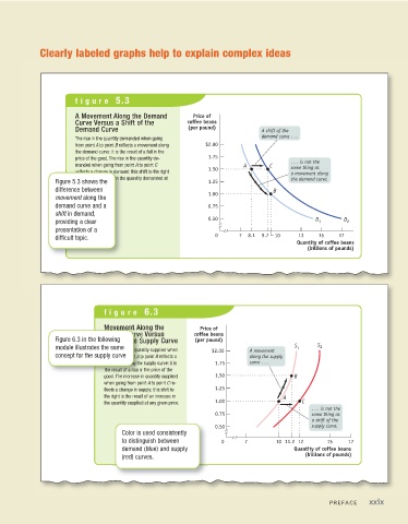
                        figure 5.3

                        A Movement Along the Demand        Price of
                        Curve Versus a Shift of the      coffee beans
                        Demand Curve                     (per pound)            A shift of the
                                                                                demand curve...
                        The rise in the quantity demanded when going
                        from point A to point B reflects a movement along  $2.00
                        the demand curve: it is the result of a fall in the
                        price of the good. The rise in the quantity de-  1.75           ...isnotthe
                        manded when going from point A to point C         A       C
                                                               1.50                     same thing as
                        reflects a change in demand: this shift to the right            a movement along
                        is the result of a rise in the quantity demanded at             the demand curve.
                  Figure 5.3 shows the                         1.25
                        any given price.
                  difference between                                               B
                                                               1.00
                  movement along the
                  demand curve and a                           0.75
                  shift in demand,
                                                               0.50
                  providing a clear                                                             D 1     D 2
                  presentation of a
                                                                  0      7  8.1  9.7  10   13    15    17
                  difficult topic.
                                                                                          Quantity of coffee beans
                                                                                             (billions of pounds)


                                figure 6.3


                                Movement Along the           Price of
                                Supply Curve Versus        coffee beans
                  Figure 6.3 in the following              (per pound)
                                Shift of the Supply Curve
                  module illustrates the same                    $2.00      A movement   S 1    S 2
                                The increase in quantity supplied when
                  concept for the supply curve                              along the supply
                                going from point A to point B reflects a
                                movement along the supply curve: it is  1.75  curve...
                                the result of a rise in the price of the
                                good. The increase in quantity supplied  1.50            B
                                when going from point A to point C re-
                                flects a change in supply: this shift to  1.25
                                the right is the result of an increase in             A
                                the quantity supplied at any given price.  1.00             C
                                                                                               ...isnotthe
                                                                  0.75                         same thing as
                                                                                               a shift of the
                                                                  0.50                         supply curve.
                                      Color is used consistently
                                      to distinguish between       0      7         10 11.2 12     15    17
                                      demand (blue) and supply                           Quantity of coffee beans
                                      (red) curves.                                         (billions of pounds)


                                                                                                    PREFACE     xxix

