
Page 9 - Brand Handbook IPG Network
P. 9
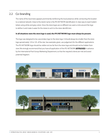
 2.2 Co-branding
The name of the local store appears prominently reinforcing the local presence while connecting this location to a national network. Close to the store’s name is the IPG NETWOYK identification in clear easy to read modern letters using white and grey colors. Since the store logos are so different we used a circle around the logo
to define it and make it easier for the stores to ad it to the store identifiction.
In all situations were the store logo is used, the IPG NETWORK logo must always be present.
The logo was designed to be a secondary logo to the store logo. It should always be smaller than the store logo aproximately 1/4 to 1/6 of the size. See examples given, use judgement for the different applications. The IPG NETWORK logo should be visible not too far from the store logo and should not be hidden from view. We strongly recommend that you have all application of the IPG NETWORK APPROVED in advance by the International Pool Group Marketing Department, so that the required criteria are met and avoid potential litigation.
POOLS ENTRANCE
ENTRÉE
ENTRANCE ENTRÉE
SORTIE
● INTERNATIONAL POOL GROUP - BRAND HANDBOOK - IPG NETWORK - JUNE - 2019
9
EXIT
EXIT SORTIE
HOT TUBS
