Page 190 - Mathematics Coursebook
P. 190
19.3 Drawing conclusions


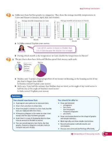
               4   Zalika sees these bar line graphs in a magazine. They show the average monthly temperatures in
                  Cairo and Harare in January, April, July and October.  Average monthly temperature in Harare
                          Average monthly temperature in Cairo
                    Average temperature (°C)  24                Average temperature (°C)  21
                                                                  24
                     28
                                                                  18
                     20
                                                                  15
                     16
                                                                  12
                     12
                                                                   9
                      8
                                                                   6
                      4
                      0
                          January
                                   April
                                       Month July  October         3 0  January  April   July   October
                                                                                   Month
                  a  Is Zalika correct? Explain your answer.
                                           I can tell it’s warmer in Harare in October than
                                           it is in Cairo because the October line is longer.


                  b  During which month is the temperature in Cairo double the temperature in Harare?
               5  The pie charts show how Akila and Medina spend their money each week.

                    Akila                   Madina
                              Housing
                              Travel
                              Food
                              Other


                  a  Medina says: ‘I spend a larger proportion of my money on housing, as the housing sector of my
                     pie chart is bigger than Akila’s.’
                     Is Medina correct? Explain your answer.
                  b  Akila says; ‘I pay half the amount that Medina does on travel, as the angle of my travel sector is
                     half the size of the angle of Medina’s travel sector.’
                     Is Akila correct? Explain your answer.

               Summary

                You should now know that:                          You should be able to:
                +   A pictogram uses pictures to represent data.   +   Draw and interpret
                +   A bar chart uses bars to show data.               –  pictograms
                                                                      –  bar charts
                +   A bar-line graph is similar to a bar chart, but the   –  bar-line graphs
                   bars are replaced with thick lines.                –  frequency diagrams
                +   A frequency diagram is the same as a bar chart    –  pie charts.
                   except that the data has been grouped.
                                                                   +   Draw conclusions based on the shape of graphs
                +   A pie chart is a way of displaying data to show   and simple statistics.
                   how an amount is divided or shared.             +   Work logically and draw simple conclusions.

                +   You can use pictograms, bar charts, bar-line   +   Record and explain methods results and
                   graphs, frequency diagrams and pie charts to       conclusions.
                   compare two sets of data.

                                                                   +   Discuss and communicate findings effectively.
                                                                                  19 Interpreting and discussing results  189

