Page 188 - Mathematics Coursebook
P. 188
19.3 Drawing conclusions


               19.3 Drawing conclusions


               You can use pictograms, bar charts, bar line graphs, frequency diagrams and pie charts to compare two
               sets of data.

               When you are asked to compare two sets of data, follow these steps.

               1   Look at the overall total number of items in each graph or chart and see if there is a big di$erence in
                  the totals.

               2  Compare the shapes of the graphs or charts and comment on how they are di$erent.


                Worked example 19.3

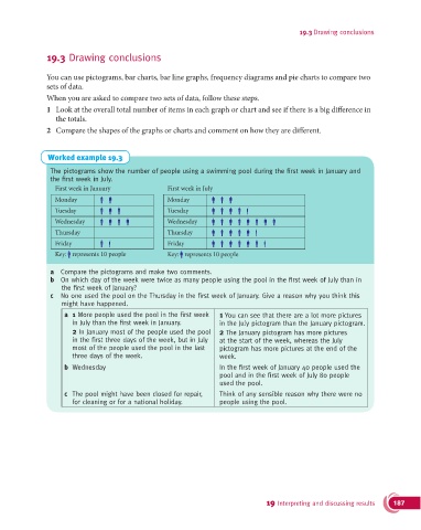
                The pictograms show the number of people using a swimming pool during the fi rst week in January and
                the fi rst week in July.
                  First week in January             First week in July
                  Monday                            Monday
                  Tuesday                           Tuesday
                  Wednesday                         Wednesday
                  Thursday                          Thursday
                  Friday                            Friday
                  Key: represents 10 people         Key: represents 10 people

                a  Compare the pictograms and make two comments.
                b  On which day of the week were twice as many people using the pool in the fi rst week of July than in
                    the fi rst week of January?
                c  No one used the pool on the Thursday in the fi rst week of January. Give a reason why you think this
                    might have happened.
                     a  1 More people used the pool in the fi rst week   1 You can see that there are a lot more pictures
                       in July than the fi rst week in January.      in the July pictogram than the January pictogram.
                        2 In January most of the people used the pool  2 The January pictogram has more pictures
                       in the fi rst three days of the week, but in July   at the start of the week, whereas the July
                       most of the people used the pool in the last   pictogram has more pictures at the end of the
                       three days of the week.                      week.
                     b  Wednesday                                   In the fi rst week of January 40 people used the
                                                                    pool and in the fi rst week of July 80 people
                                                                    used the pool.

                     c   The pool might have been closed for repair,   Think of any sensible reason why there were no
                       for cleaning or for a national holiday.      people using the pool.


                                                                                  19 Interpreting and discussing results  187

