Page 183 - Mathematics Coursebook
P. 183

19.1 Interpreting and drawing pictograms, bar charts, bar-line graphs and frequency diagrams


               A bar-line graph is similar to a bar chart, but you use thick lines instead of bars.


               Worked example 19.1C
                                                                                            Favourite sports
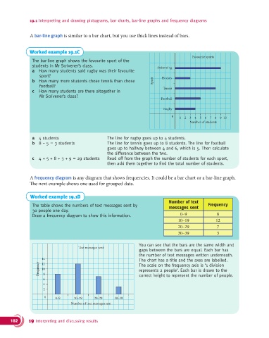
                The bar-line graph shows the favourite sport of the
                students in Mr Scrivener’s class.                           Swimming
                a  How many students said rugby was their favourite
                    sport?
                b  How many more students chose tennis than chose         Sport  Hockey
                    football?
                c  How many students are there altogether in                  Tennis
                    Mr Scrivener’s class?
                                                                             Football

                                                                               Rugby
                                                                                  0   1  2  3  4  5  6  7  8  9 10
                                                                                           Number of students


                a  4 students                       The line for rugby goes up to 4 students.
                b  8 − 5 = 3 students                 The line for tennis goes up to 8 students. The line for football
                                                    goes up to halfway between 4 and 6, which is 5. Then calculate
                                                    the difference between the two.
                c  4 + 5 + 8 + 3 + 9 = 29 students  Read off from the graph the number of students for each sport,
                                                    then add them together to find the total number of students.


               A frequency diagram is any diagram that shows frequencies. It could be a bar chart or a bar-line graph.
               #e next example shows one used for grouped data.


               Worked example 19.1D
                                                                                 Number of text
                The table shows the numbers of text messages sent by             messages sent      Frequency
                30 people one day.
                Draw a frequency diagram to show this information.                    0–9               8
                                                                                     10–19             12
                                                                                     20–29              7
                                                                                     30–39              3


                                                                   You can see that the bars are the same width and
                                      Text messages sent
                                                                   gaps between the bars are equal. Each bar has
                                                                   the number of text messages written underneath.
                     14                                            The chart has a title and the axes are labelled.
                   Frequency  12 8                                 The scale on the frequency axis is ‘1 division
                     10
                                                                   represents 2 people’. Each bar is drawn to the
                      6                                            correct height to represent the number of people.
                      4
                      2
                      0    0–9      10–19     20–29    30–39
                                   Number of text messages sent


      182      19 Interpreting and discussing results
   178   179   180   181   182   183   184   185   186   187   188