Page 182 - Mathematics Coursebook
P. 182
19.1 Interpreting and drawing pictograms, bar charts, bar-line graphs and frequency diagrams


                      I
               19.1  nterpreting and drawing pictograms, bar charts, bar-line graphs
                      and frequency diagrams

               In a pictogram, you use pictures to represent data. You can use each picture to represent an item or a
               number of items. #e key shows how many items one picture represents. When you draw a pictogram you

               must make sure that:
               t  the pictures are all the same size
               t  the pictures are in line horizontally and vertically
               t  you include a key.

               Worked example 19.1A
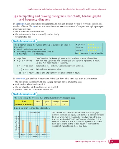
                The pictogram shows the number of hours of sunshine on 1 July in   Cape Town
                three cities.                                                      Manama
                a  Which city had the least sunshine?                              New York
                b  How many hours of sunshine were there in:
                   i  New York       ii  Manama?                                  Key:  represents 2 hours of sunshine

                a  Cape Town           Cape Town has the fewest pictures, so has the least amount of sunshine.
                b  i  4 × 2 = 8 hours   New York has 4 pictures. The key tells you that 1 picture represents 2 hours.
                                       So New York has 8 hours of sunshine.
                                                     1
                   ii  5 × 2 = 10 hours  Manama has 5  pictures. 5 pictures represent 10 hours.
                                                     2
                       1
                      5  × 2 = 1 hour  Half a picture represents 1 hour.
                       2
                     10 + 1 = 11 hours  Add 10 and 1 to work out the total number of hours.

               In a bar chart, you use bars to show data. When you draw a bar chart you must make sure that:
               t  the bars are all the same width and the gap between bars is always the same
               t  each bar has a label underneath it
               t  the bar chart has a title and the axes are labelled
               t  you use a sensible scale on the vertical axis.

               Worked example 19.1B

                The table shows the favourite fruit of the students in Mrs Hassan’s class.
                         Fruit         apple     pear     orange   banana
                 Number of students      7         6        4         8

                Draw a bar chart to show this information.

                                 Favourite fruit         You can see that the bars are the same width and gaps
                                                         between the bars are equal. Each bar has a label underneath
                   Number of students  7                 the axes are labelled ‘Fruit’ and ‘Number of students’. The
                    9
                                                         to show which fruit it represents. The chart has a title and
                    8
                                                         scale on the vertical axis is ‘1 division represents 1 student’.
                    6
                                                         Each bar is drawn to the correct height to represent the
                    5
                    4
                                                         number of students who chose that fruit.
                    3
                    2
                    1
                     0
                       Apple    Pear  Orange Banana
                                    Fruit
                                                                                  19 Interpreting and discussing results  181

