Page 186 - Mathematics Coursebook
P. 186
19.2 Interpreting and drawing pie charts


               19.2 Interpreting and drawing pie charts


               You can use a pie chart to display data showing how an amount is divided or shared. A pie chart is
               drawn as a circle divided into sections called sectors. #  e angles at the centres of all the sectors add up
               to 360°. When you draw a pie chart you must make sure that you label each sector and draw the angles
               accurately.


                Worked example 19.2
                                                                      Favourite animals of the
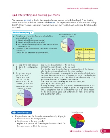
                a  The pie chart shows the favourite animal of the      students in class 7A
                    students in class 7A.
                   i  Which animal is the most popular?
                   ii  Which animal is the least popular?                Donkey
                   iii   Can you tell from the pie chart how many students        Dog
                      are in class 7A?                                   Horse
                b  The table shows the favourite animal of the students                   Animal    Frequency
                    in class 7B.                                                Cat
                   Draw a pie chart to show this information.                              dog          8
                                                                                            cat         7
                                                                                           horse       10
                                                                                          donkey        5

                a  i   Dog is the most popular.   Dog has the biggest sector of the pie chart.
                   ii  Cat is the least popular.   Cat has the smallest sector of the pie chart.
                   iii  No                         The pie chart only shows the fraction, or proportion, of the students
                                                 who like the various animals, not the actual numbers.
                b  8 + 7 + 10 + 5 = 30           First add the frequencies to work out the total number of students in
                    360° ÷ 30 = 12°              the class. Work out the number of degrees per student by dividing the
                    Dog: 8 × 12 = 96°            total number of students into 360°. Multiply each frequency by 12° to
                    Cat: 7 × 12 = 84°            get the total number of degrees for each sector.
                    Horse: 10 × 12 = 120°        Check that the total of the degrees does add up to 360°.
                   Donkey: 5 × 12 = 60°          96° + 84° + 120° + 60° = 360°
                                                   Start by drawing a circle and then draw a line from the centre to the
                    Favourite animals of the
                     students in class 7B        top of the circle. Measure an angle of 96° for the ‘dog’ sector, then
                                                 draw a straight line from the centre to the edge of the circle. Repeat
                                                 for the other sectors. Label each sector with the name of the animal
                      Donkey                     and give the chart a title.
                                Dog


                      Horse
                                Cat


               )     Exercise 19.2                                                  Favourite colour

               1  The pie chart shows the favourite colours chosen by 40 people.          Red
                  a  Which colour is the most popular?
                  b  Which colour is the least popular?                             Green     Yellow
                  c  Explain how you can tell from the pie chart that blue is the          Blue
                     favourite colour of 10 of the people.


                                                                                  19 Interpreting and discussing results  185

