
Page 131 - PAPER PRESENTATION 2ND
P. 131
PAPER PRESENTATION 2019
Example 2
Table 2.2 Projected Home Use Retention of Selected Languages in Australia (From
Clyne 1991:257)
Language Numbers
Italian 251,156
Greek 210,595
German 48,641
Maltese 28,208
Dutch 21,586
Another way of presenting the data as
Charts and graphs
presented in table is by using charts and graphs.
provide more
Generally, there are three different types of charts
and graphs namely bar charts, pie charts, and
dramatic and
interesting way of line graphs.
presenting the
data.
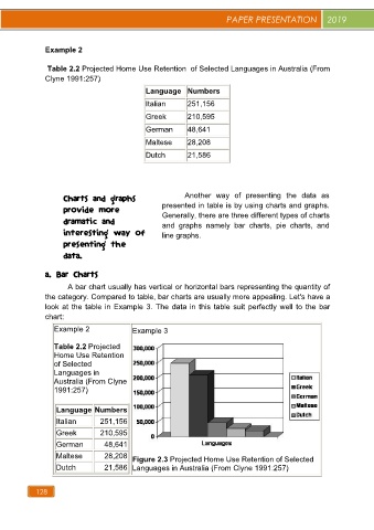
a. Bar Charts
A bar chart usually has vertical or horizontal bars representing the quantity of
the category. Compared to table, bar charts are usually more appealing. Let's have a
look at the table in Example 3. The data in this table suit perfectly well to the bar
chart:
Example 2 Example 3
Table 2.2 Projected
Home Use Retention
of Selected
Languages in
Australia (From Clyne
1991:257)
Language Numbers
Italian 251,156
Greek 210,595
German 48,641
Maltese 28,208 Figure 2.3 Projected Home Use Retention of Selected
Dutch 21,586 Languages in Australia (From Clyne 1991:257)
128