
Page 132 - PAPER PRESENTATION 2ND
P. 132
PAPER PRESENTATION 2019
b. Pie charts
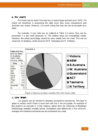
Pie charts can be used if the data are on percentage and add up to 100%. Pie
charts are beneficial in presenting the date since they show comparisons and
divisions very clearly. However, it is worth noting that they are not as accurate as a
table.
For example, if your data are as outlined in Table 4.2 below, they can be
presented in a pie chart (Example 4). The relative sizes are immediately visible.
However, the actual percentage cannot be seen clearly from the chart. This can be
observed, for instance, at the slices for ACT, Tasmania and N. Territory).
Example 4
Table 4.2 Italy-
born by State
in Australia
1991 (1991
Census, ABS)
State %
VIC 41.7
NSW 27.7
SA 11.4
WA 10.5
QLD 6.9
ACT 1.1
TAS 0.5
NT 0.2
Australi 100.
a 0
Figure 4.3 Italy-born by State in Australia 1991 (1991 Census, ABS)
c. Line Graph
Line graphs can be utilized for showing comparisons and trends. This type of
graph is usually used if there is more than one line in the one graph. An example of
line graph is on example 5. In this instance, (taken from the University of Reading's
Meteorology website) monthly trends, fluctuations and differences in the minimum,
average and maximum temperatures are presented very clear.
129