
Page 45 - The Real Work Of Data Science Turning Data Into Information, Better Decisions, And Stronger Organizations by Ron S. Kenett, Thomas C. Redman (z-lib.org)_Neat
P. 45
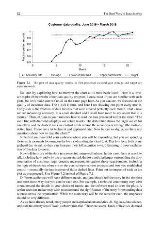
32                                                  The Real Work of Data Science


                              Customer data quality, June 2016 – March 2018

                  1
                Fraction perfect records  0.8
                 0.9


                 0.7
                 0.6
                 0.5
                    0             5             10            15            20
                                                Month
                Accuracy rate  Average    Lower control limit  Upper control limit  Target

           Figure 7.1  The plot of data quality results, as first presented (second‐year average and target are
           superimposed).

             So, start by explaining how to interpret the chart at its most basic level: “Here is a time‐
           series plot of the results of our data quality program. I know most of you are familiar with such
           plots, but let’s make sure we’re all on the same page here. As you can see, we focused on the
           quality of customer data. The x‐axis is time, and here I am showing one point every month.
           The y‐axis is the fraction of data records that were created perfectly each month. That’s how
           we are measuring accuracy. It is a tall standard and I shall have more to say about that in a
           minute.” Then, explain to your audience how to read the data presented within the chart: “The
           solid line with diamonds displays our actual results. The dotted line shows the target we set for
           ourselves, and the dashed lines are control limits around the second‐year average (the dashed–
           dotted line). These are a bit technical and explained later. Now before we dig in, are there any
           questions about how to read the chart?”
             Note that you have told your audience where you will be expanding, but you are spending
           these early moments focusing on the basics of reading the chart first. This lets them fully com-
           prehend the visual, so they can then put their full attention toward listening to your explana-
           tion of the data to come.
             Now tell the story of the data in a powerful, animated fashion. In this case, there is much to
           tell, including how and why the program started; the joys and challenges surrounding the doc-
           umentation of customer requirements; measurements against those requirements, including
           the logic of the choice of metric on the y‐axis; improvement projects; and how you established
           control – essentially the implications of those dashed lines. Point out the impact of each on the
           plot as you proceed. Use Figure 7.2 instead of Figure 7.1.
             Different audiences will have different needs, and you should tell the story in the simplest
           and most direct way that you can for each one. For example, a technical community may wish
           to understand the details in your choice of metric and the software used to draw the plots. A
           senior decision‐maker may wish to understand the significance of the story for extending data
           science across the organization. While the main story will be the same for each, the emphases
           should be very different.
             As we have already noted, many people are skeptical about analytics, AI, big data, data science,
           and statistics (many recall Twain’s observation that “There are several kinds of lies: lies, damned